
Mako Construction & Renovations
Logo Design 2024

A surfing inspired construction company logo! For this logo build, the client had a very solid idea of what they wanted for their logo; a badge style logo with shark details in blue and grey.
The fonts used for the logo are Sofachrome Regular (primary) and Montserrat Medium (secondary). The centre icon is a custom shark fin design on both logo variations, along with a custom shark teeth border around the company name on the badge logo.
The deliverables consisted of 2 logo variations:
Badge Logo - colour variations with blue/black/grey and black/white versions
Stack Logo - colour variations with blue/black/grey and black/white versions


Alpha Tread Corp.
Logo Design 2023

As ownership of a tire shop changed, so did the name of the company. My client from Alpha Tread had purchased this tire business and already had the name developed. They wanted to play off the term “alpha” and use it as inspiration for the logo.
The Alpha Tread logo was going to be used for business cards, documents, large decals, and outdoor signs. This gave me a good idea of how versatile the size of the logo needed to be.
Because the name “alpha” was also going to be used for the detailing department of the business, the brand did not specifically require a visual reference to a tire or wheel in the logo.
Because of the bold nature of the design, I wanted to pair this with a bold and rigid font. In order to balance the boldness of the icon and “Alpha”, the light version of the same font was used for “Tread Corp”.


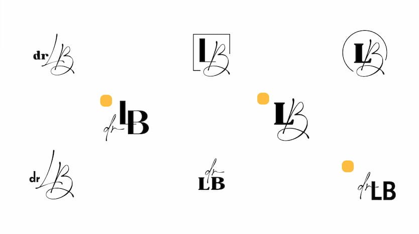
Dr. Lisa Belanger
Rebrand 2023

As Dr. Lisa’s in house designer at the time, I had the opportunity to rebrand Lisa’s personal/speaker brand. As a speaker, her brand would be represented through her website, presentation slides, proposal documents, social media, and any printout promotional material used at her speaking events.
The deliverables required included:
logo suite
colour palette
font pairing
brand voice
As you can see, the look and feel displays a combination of organic and structure. The personal brand required both elements in order to reflect Lisa’s love for nature and her connection to the corporate industry, seeing as she works with professionals in the workplace.
The deep emerald green and script style font captures the essence of nature, while the bold font and simplistic style anchors the brand with a sense of professionalism.


Express Windows & Auto Glass
Logo Suite 2023
This project required a logo suite. It was also required by the client to keep the same colour palette as the previous logo. As you can see, there was an existing logo from the previous owners of the business.
Auto glass services was being added to the business with the new owners so they wanted a fresh look!
You can see part of the process with the different logo designs they went through. The idea was to include a visual reference to both the windows and auto departments of the company. Because of the nature of the primary logo, I wanted to ensure that the secondary logo could be used for smaller spaces and provide a clean and simple mark.
As for the favicon, inspiration was taken from the window pane in the primary logo to provide a cohesive logo suite.


